

An identity made for an unhurried, effortless life.
Selavu means “holiday” in Telugu, and the brand was created around that very feeling. Its resort wear is designed for moments when time slows down: long afternoons, warm weather and the luxury of having nowhere else to be. The identity needed to feel just as effortless, simple, elegant and unhurried.

The Approach
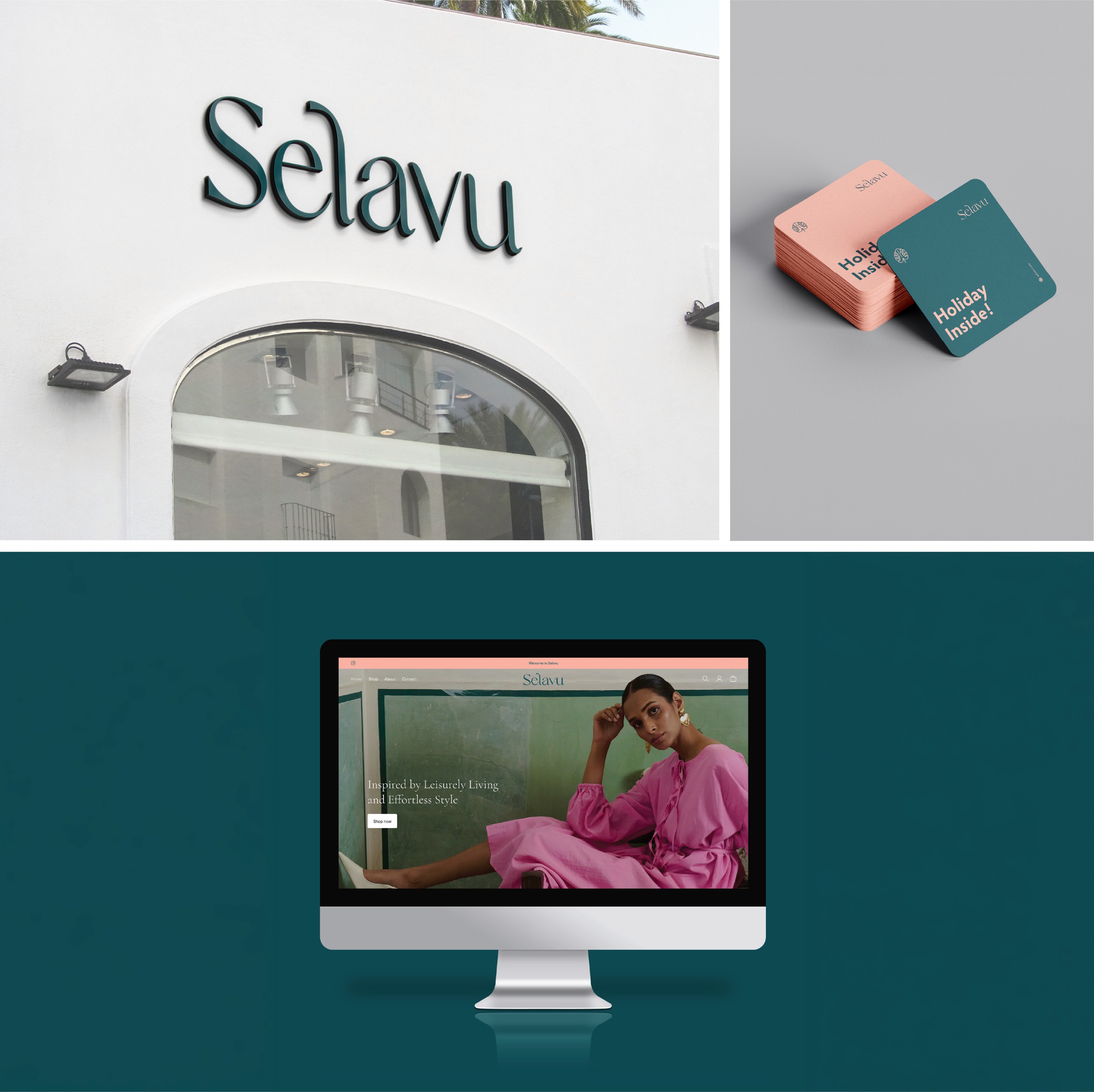
Rather than rely on familiar symbols of travel or resort wear, we wanted the feeling of a holiday to come through in the most essential parts of the identity: its type and colour. We imagined Selavu as a world of tropical ease and understated luxury, where comfort never feels casual and sophistication never feels overly considered.


The Solve
A relaxed yet refined wordmark gives Selavu its distinct character, balancing laid-back comfort with quiet sophistication. The salmon and bottle-green palette brings another layer of sensory memory, recalling watermelon, warm beaches and the lushness of the tropics. Together, the typography and colour create an identity that feels like being on holiday before the holiday has even begun. The only thing missing is a mimosa in hand.



Project Credits:
Vydika Rao, Bhakti Biyani