
Star Papaya
Visual Identity, Packaging
Industry:
Children's Space
Year:
2024
A small ask, with a whole world behind it.
Star Papaya began with two mothers and the stories they built for their children.
Tara and Maya became the quiet inspiration behind the name: Star and Papaya. What began as something personal grew into a larger belief that childhood deserves a world shaped by creativity, curiosity and make-believe.
The founders wanted other children to experience the kind of wonder their own children found in stories: enchanted woods, extraordinary afternoons and worlds where the everyday could turn into something else entirely.
When they came to us, the ask was simple: a logo and packaging.
But behind that small brief was a much larger question.
How do you make something simple still feel like wonder?
The Challenge
A children’s brand can easily become loud, overly cute or dependent on familiar visual codes of childhood.
Star Papaya needed something gentler as well as elaborate. A simple logo wasn't going to represent an entire world.
The identity had to feel imaginative without becoming decorative, playful without becoming noisy, and simple enough to live across products and packaging while still leaving room for a child’s imagination to enter.
The opportunity was not to illustrate an entire fantasy world for them.
It was to create just enough of one that reminds them of their imaginative world.
The Approach
Building between the real and the imagined
We began with the name itself.
A star and a papaya. One celestial, one earthly. One belongs to the sky, the other grows from the ground.
That unlikely pairing became the foundation of the brand world.
We imagined them drifting together on a cloud: a small visual portal between what children see and what they can imagine. From there, the identity began to take shape through rounded forms, open compositions and a visual language that felt soft, familiar and slightly unexpected.
The aim was never to explain the world completely.
It was to leave enough space for a child to continue it.


Designing a world that changes with light
The colour palette grew from the transition between day and night.
Teal and coral carried the warmth and curiosity of the day. Deep turquoise and peach moved the world into night. Together, they created a sense of twilight: that in-between hour when play becomes story and story becomes dream.
This duality gave the identity more than a palette. It gave it a rhythm.
A world that could change mood without changing character.

Giving the story a visual language
The logo carries the same balance.
Soft letterforms and playful details give the wordmark a sense of familiarity, while clouds, stars and fruit create a small constellation around it. Every element is deliberate, but none tries to complete the story.
Rather than fill every surface with imagination, we created the conditions for imagination to happen.


The Solve
From identity to object
The founders had asked for packaging.
We saw an opportunity to make the packaging part of the story itself.
Not interactive for the sake of novelty, but designed so that opening, turning and holding the box could continue the world of Star Papaya.
Two packaging directions emerged.


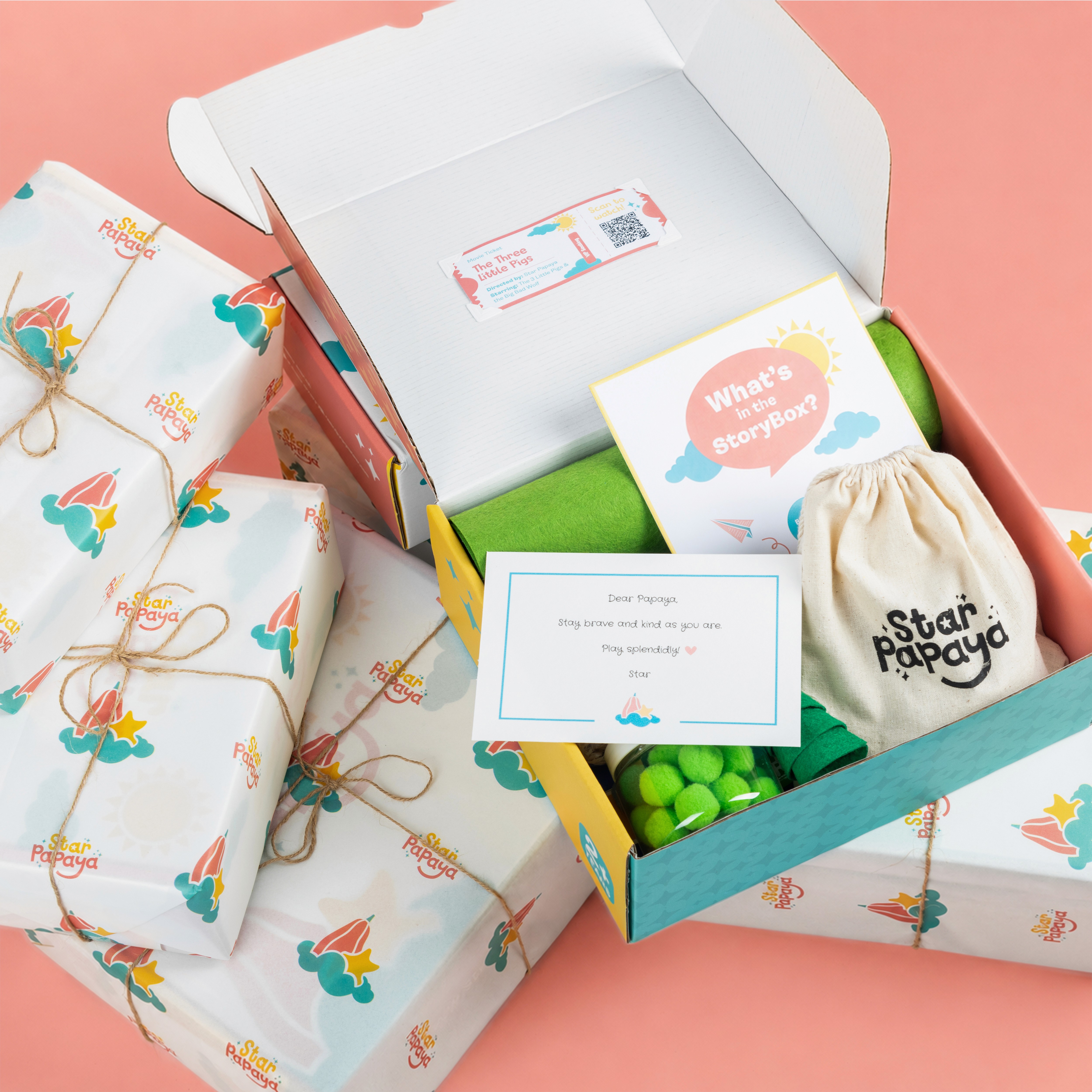
The Storybook Box
A box designed to open like a classic hardbound children’s book.
The format transformed packaging into something familiar before the product was even revealed: an object to open, explore and return to.
It did not simply contain the product.
It created a beginning.
The Day / Night Box
A reversible world with two distinct moods.
One side carried the warmth of day. The other held the quiet of night. By simply turning the box, the same world moved through time.
The idea extended the brand’s central duality into a physical object, making imagination feel continuous rather than fixed.

A system beyond the original brief
What began as a request for a logo and packaging grew into a complete visual world.
The identity, colour system, illustrations of living characters of imagination and packaging were designed to move together, giving Star Papaya a language that could extend beyond its first product without losing its sense of wonder.
This was not expansion for the sake of adding more design.
It was a response to what was already present in the founders’ story.
We recognised the world they had begun, drew it out and gave it form.
Between play and purpose
Designing for children is never only about children.
It shapes some of their earliest memories of colour, form, touch and curiosity. The things they encounter now may become part of how they remember wonder later.
Star Papaya reminded us that play deserves rigour too.
That a box can become a memory of their childhood.
That a symbol can become a world.
And that sometimes, the role of design is not to invent more meaning, but to make visible what was already there.